Using Data Analysis to Shape Musical Interpretation: A Look Inside The Nutcracker Overture
This fall, I had the chance to conduct Tchaikovsky’s Nutcracker Overture with the Knox-Galesburg Symphony. It’s a piece everyone thinks they know, light, sparkling, familiar. But preparing it with data analysis opened up details I’d never noticed through score study alone. That’s what I want to share with you here: how data analysis can reveal musical structure, guide interpretation, and help conductors and performers make clearer decisions.
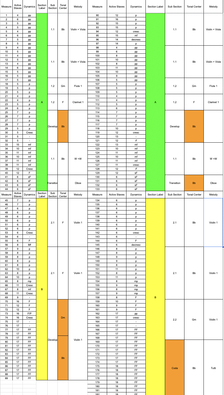
I built a bar-by-bar spreadsheet tracking six elements:
Active staves (how many instruments are actually playing)
Dynamic level
Large Structure
Smaller Structure
Tonal center
Who has the melody
I then used this to create something comprehensible at a glance.
What did we learn from this?
1. The Form: A–B–A–B Form (with a coda)
The shape of the piece is immediately apparent: two A sections that are nearly identical, two B sections that are similar but not identical. Tchaikovsky relies on structure the way a pop writer relies on a chorus-and-verse structure, making listeners want that return. Maybe this is why this is such a famous piece of music.
2. Texture Drives Expression
The chart showing active staves is the unsung hero.
You literally see how Tchaikovsky handles orchestration:
The A sections are incredibly sparse: 4–6 staves, no low strings or brass, tiny bursts of color that create excitement through lightness.
The B sections explode to 17+ active staves, fortissimo dynamics, and long stretches without melodic handoffs.
A conductor doesn’t need to manufacture contrast; the orchestration is the contrast.
3. Dovetailing Is Everywhere
One of the most unique insights the chart exposes is how gradually Tchaikovsky shifts texture.
He rarely changes both dynamics and orchestration simultaneously.
Instead, he blends the transitions:
First, a dynamic shift…
Then, slowly, new instruments join or leave.
That dovetailing creates the “effortless” feeling that performers often try to imitate without fully understanding why it works, making transitions flow more easily.
How This Informs Conducting Decisions
Data simplifies what gesture should express.
In sparse A sections, I kept the pattern small and close to the face to show lightness and limited instrumentation.
As the staves increased, I reduced the pattern and expanded the gesture size to match the increasing thickness.
In the B sections, the stability of the violin melody meant I could use my left hand far more for phrasing instead of cuing.
The second A section needed to feel like a true repeat: clean, intentional, and almost identical.
The second B section, however, contains fundamental harmonic changes, so I let the orchestra sense that difference through facial cues, broader shaping, and more energized gesture.
And in the final tutti—18 staves, the largest of the overture, the best thing a conductor can do is show direction while getting out of the way and letting the ensemble rip. “LET IT RIP”
Why This Matters for Conductors and Performers
Data doesn’t replace musical intuition; it supports it.
It reveals:
Structure you may not notice,
balance decisions hidden inside orchestration,
when to shape more and when to leave space,
And how the composer uses texture to communicate.
For ensembles, this kind of analysis helps players understand why a moment feels light, heavy, or transitional and how their part fits into the bigger picture.
Analyzing The Nutcracker Overture provided me with a more objective, bird’s-eye view of the music. Even if everything didn’t translate perfectly in performance, the method sharpened my preparation and clarified choices I might not have spotted otherwise. If you want to see how this played out on the podium, check out the video below. I will be honest, a lot of thought went into this, but it didn’t necessarily play out perfectly.
https://www.youtube.com/watch?v=HnWoZ5ZlEwE